
Ever cracked open a user manual guide only to feel more confused than when you started? You’re not the only one.
Poor documentation frustrates customers, floods support teams with avoidable questions, and damages brand reputation. Here’s the hard truth: 68% of customers say they’ve stopped using a product because the instructions were too complicated.
But here’s the good news. Creating a user manual doesn’t require a PhD in technical writing. You just need a clear process, practical templates, and an understanding of what your users actually need.
This guide will walk you through everything—from planning your first draft to publishing professional documentation that users actually read. Whether you’re figuring out how to create a user manual for software or building instructions for a physical product, you’ll find actionable steps that work.
Let’s get started.
What Is a User Manual? (And Why It Matters)
The Real Definition
A user manual is your product’s voice when you’re not in the room. It’s the instruction manual that transforms a confused first-time buyer into a confident user.
Think of it as a bridge. On one side sits your product with all its features and complexity. On the other side stands your customer who just wants to solve their problem. The manual connects these two worlds.
User manuals serve three core purposes:
- Guide users through setup and basic operations
- Document advanced features for power users
- Provide troubleshooting help when things go wrong
User Manual vs. User Guide vs. Instruction Manual
People often use these terms interchangeably, but subtle differences exist:
| Document Type | Primary Purpose | Typical Length | Best For |
|---|---|---|---|
| User Manual | Comprehensive reference for all features | 20-100+ pages | Complex products, software |
| User Guide | Task-focused instructions | 10-30 pages | Specific workflows, processes |
| Instruction Manual | Step-by-step assembly/setup | 5-15 pages | Hardware setup, installation |
| Quick Start Guide | Get running in minutes | 1-4 pages | Initial setup only |
Types You’ll Encounter
Software user manuals explain digital products. They cover installation, navigation, features, settings, and integrations. These live online most of the time, making updates easier.
Hardware user manuals document physical products. They include assembly instructions, safety warnings, maintenance procedures, and troubleshooting for mechanical issues.
Product guides blend both worlds. Think smart home devices—they need software setup instructions plus physical installation guidance.
Operating manuals focus on daily use after setup. Industrial equipment, commercial appliances, and professional tools typically include these.
The Business Impact Nobody Talks About
Quality documentation isn’t just nice to have. It directly impacts your bottom line.
Companies with excellent user manuals see support ticket volumes drop by 40-60%. That’s real money saved on customer service staffing.
Better yet? Products with clear documentation have 25% higher customer satisfaction scores according to recent usability studies. Happy customers leave better reviews, refer friends, and buy again.
There’s also the legal angle. Proper warning labels and safety instructions in your manual provide liability protection. Courts have ruled against companies that failed to document known hazards adequately.
Pre-Planning: What You Need Before You Start
Know Your Audience Inside and Out
You can’t write effective instructions without understanding who’ll read them. Start by creating a user profile.
Ask these questions:
- What’s their technical skill level?
- Are they industry professionals or everyday consumers?
- What language do they speak natively?
- What problems are they trying to solve?
A manual for accounting software aimed at CPAs looks completely different from one targeting small business owners. The CPA version can use industry terminology freely. The small business version needs plain language explanations.
Age matters too. Younger users often prefer video tutorials and interactive help, while users over 50 typically want detailed written instructions they can print and reference.
Gather Your Essential Information
Before writing a single word, collect everything you’ll need:
Product specifications tell you what you’re documenting. Get the full feature list, technical capabilities, dimensions, power requirements, and compatibility details.
Common use cases reveal what users actually do with your product. Interview your sales team, read customer emails, and browse support tickets. You’ll discover which features matter most.
Known issues belong in your troubleshooting section. Your support team keeps a goldmine of information about recurring problems and their solutions.
Safety considerations can’t be overlooked. Work with your engineering team to identify every potential hazard, no matter how unlikely.
Choose Your Format Wisely
The days of only offering printed manuals are long gone. You’ve got options now.
PDF user manuals work well for products that don’t change often. Users can download them, save them offline, and print specific pages. They’re searchable and maintain consistent formatting across devices.
Online documentation shines for software and digital products. You can update it instantly when features change. Add videos, interactive demos, and links between related topics. Plus, you can track which sections users visit most.
Printed manuals still matter for certain products. Power tools, medical devices, and appliances often require them for legal compliance. Users appreciate having something physical for equipment they’ll use for years.
Knowledge base integration transforms your manual into a searchable help center. Users type questions and find answers instantly. This approach works brilliantly for SaaS products.
The best approach? Offer multiple formats. Provide a downloadable PDF for offline reference while maintaining an updated online version.
Select Your Tools
How to create a user manual in Word remains the most common approach. Microsoft Word offers familiar formatting tools, collaboration features, and template options. It exports to PDF easily and most people already know how to use it.
However, Word has limitations. Version control gets messy with multiple contributors. Updating screenshots across dozens of pages becomes tedious. And converting to online formats requires extra work.
Dedicated documentation tools solve these problems:
- MadCap Flare handles large, complex manuals with ease
- Adobe FrameMaker excels at technical documentation with extensive graphics
- Confluence works well for internal documentation and team collaboration
- GitBook turns Markdown files into beautiful online docs
- Help & Manual creates both PDFs and online help from a single source
For basic needs, how to create a user manual in PowerPoint might work if you’re building a highly visual quick-start guide. But it’s not ideal for lengthy, text-heavy documentation.
Start simple. Word or Google Docs gets you moving quickly. Upgrade to specialized tools later when your documentation needs grow.
User Manual Structure: Essential Components
Cover Page & Title
First impressions count. Your cover page should clearly display:
- Product name and model number
- Manual version and publication date
- Company logo and branding
- Copyright information
Include a version number even if it’s your first release. When you update the manual later, users can verify they’re reading the latest version.
Table of Contents
Never skip this. 87% of users scan the table of contents first to find what they need.
Structure it logically with clear headings. Use descriptive titles instead of vague ones:
❌ “Getting Started”
✅ “Installing and Configuring Your Software”
❌ “Features”
✅ “Creating Reports and Exporting Data”
Page numbers are mandatory for printed manuals. For digital versions, make every entry a clickable link.
Introduction Section
Set expectations right away. Your introduction should answer:
What does this product do? Give a concise overview in 2-3 sentences. Avoid marketing fluff. Stick to functional benefits.
Who is this manual for? Specify if it’s written for beginners, advanced users, or administrators.
What’s in the box? List all included components. Users want to verify nothing’s missing before they start.
Safety warnings deserve prominent placement. Use warning symbols that meet international standards:
- 🔴 DANGER – Immediate hazards that can cause death or serious injury
- 🟠 WARNING – Hazards that could cause death or serious injury
- 🟡 CAUTION – Hazards that may cause minor or moderate injury
Getting Started
This section transforms an unopened box into a functioning product. Keep it simple and linear.
Installation instructions should assume zero prior knowledge. Don’t write “Install the software.” Instead write “Double-click the downloaded file, then click Next on each screen.”
System requirements matter for software manuals. Specify:
- Operating system versions
- Minimum RAM and storage
- Required dependencies
- Browser compatibility
Initial configuration covers the first-time setup wizard, account creation, or basic settings that must be configured before use.
Use numbered steps. People follow them more reliably than paragraph instructions.
Main Features & Instructions
Here’s where structure makes or breaks your manual.
Task-based organization beats feature-based organization every time. Instead of “The Dashboard Menu,” write “How to View Your Monthly Sales Summary.”
Users don’t care about features. They care about getting their job done.
Each task should include:
- Clear objective (“How to Export Customer Data”)
- Prerequisites (“You must have Admin access”)
- Numbered steps with screenshots
- Expected outcome (“You’ll receive a CSV file in your Downloads folder”)
Screenshots need annotations. Circle the relevant button. Add arrows pointing to important fields. Don’t make users hunt for what to click.
Keep instructions conversational: “Click the Export button in the top-right corner” flows better than “The Export functionality can be accessed via the button located in the upper-right quadrant of the interface.”
Troubleshooting Guide
This section saves your support team countless hours.
Organize problems by symptom, not by technical cause. Users search for “Why won’t my device turn on?” not “Power supply circuit diagnostics.”
Use this format for each issue:
Problem: Application crashes when opening large files
Possible Causes: Insufficient memory, corrupted file, outdated software
Solutions:
- Close other applications to free up memory
- Try opening a smaller file to test if the issue persists
- Update to the latest software version
- Contact support if the problem continues
FAQs Section
Your FAQ section handles questions that don’t fit elsewhere.
Don’t include fake questions. Only add questions real users have actually asked. Check your support email, read customer reviews, and talk to your sales team.
Common FAQ topics include:
- Licensing and activation
- Data privacy and security
- Compatibility with other products
- Upgrade and downgrade procedures
- Subscription and billing (for software)
Appendices
Technical specifications, warranty terms, regulatory compliance information, and contact details belong here. Most users won’t read these sections unless they need them, so keeping them separate maintains good flow in the main manual.
Include a glossary if you’ve used technical terms. Define each one clearly without assuming knowledge.
How to Create a User Manual: Step-by-Step Process
Define Your Manual’s Scope
You can’t document everything. Trying to cover too much creates bloated, confusing manuals that nobody reads.
Start by identifying your must-have topics:
- Core features that 80% of users need
- Critical safety information
- Common tasks users perform weekly
- Setup and installation
Save the nice-to-have topics for later versions:
- Advanced features used by power users only
- Edge cases and rare scenarios
- Technical background information
- Detailed API documentation (this often becomes separate docs)
Create a priority matrix:
| Priority | Examples | Action |
|---|---|---|
| P0 – Critical | Safety warnings, basic setup | Must include in v1.0 |
| P1 – Important | Common workflows, troubleshooting | Include in v1.0 |
| P2 – Useful | Advanced features, customization | Include if space allows |
| P3 – Nice to have | Technical deep-dives, history | Save for future versions |
Create Your User Manual Outline
Your outline is the blueprint. Spend time getting it right.
Use a hierarchical structure with clear levels:
Main Section (H1)
  Subsection (H2)
    Specific Task (H3)
      Detailed Steps
Don’t nest more than three levels deep. Users get lost in overly complex hierarchies.
Sample outline for software:
Introduction
Getting Started
  System Requirements
  Installation Process
  Initial Setup
Core Features
  Creating Your First Project
  Managing User Accounts
  Running Reports
Advanced Features
  Custom Integrations
  API Access
  Automation Rules
Troubleshooting
  Common Issues
  Error Messages
  Getting Support
Write Clear, Concise Content
Technical writing differs from other writing. Clarity beats cleverness every single time.
Follow these principles:
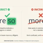
Use active voice. Write “Click the Save button” instead of “The Save button should be clicked.”
Choose simple words. Replace “utilize” with “use.” Replace “facilitate” with “help.” Your goal isn’t to impress people with vocabulary.
Keep sentences short. Aim for 15-20 words maximum. One idea per sentence.
Eliminate unnecessary words. “In order to” becomes “to.” “At this point in time” becomes “now.”
Use consistent terminology. If you call something a “workspace” on page 5, don’t call it a “project area” on page 12. Pick one term and stick with it.
Write in second person. “You can export data by…” connects better than “Users can export data by…”
Bad example: “The utilization of the export functionality is facilitated through the interface which can be accessed by users who possess the requisite administrative permissions.”
Good example: “To export data, you need admin access. Click Export in the top menu.”
Add Visual Aids
People remember 65% of information when it’s paired with relevant images. They remember only 10% when they just read text.
Screenshots should:
- Show the actual interface, not mockups
- Include only relevant portions (crop out unnecessary areas)
- Use callouts to highlight important elements
- Display realistic data, not Lorem Ipsum placeholders
- Match your product’s current version
Add annotations using:
- Numbered circles for step sequences
- Red boxes to highlight clickable elements
- Arrows to show movement or direction
- Text labels for unclear buttons
Diagrams work better than screenshots for:
- System architecture
- Workflow processes
- Network configurations
- Physical assembly
Tables organize comparative information:
| Plan Type | Storage Limit | User Accounts | Monthly Cost |
|---|---|---|---|
| Basic | 10 GB | 1 | $9 |
| Pro | 100 GB | 5 | $29 |
| Enterprise | Unlimited | Unlimited | Custom |
Videos complement written instructions for complex procedures. Keep them under 3 minutes. Add captions for accessibility.
Format for Readability
Typography choices impact comprehension more than most people realize.
Font selection matters:
- Use sans-serif fonts (Arial, Calibri, Open Sans) for screen reading
- Stick with serif fonts (Times New Roman, Georgia) for printed manuals
- Never use decorative or script fonts for body text
- Limit your manual to two fonts maximum
Size guidelines:
- Body text: 11-12pt for print, 14-16pt for screen
- Headings: Scale up by 2-4 points per level
- Captions: 1-2 points smaller than body text
White space prevents visual overwhelm. Don’t cram every inch of the page with content. Use:
- 1.5 line spacing for body text
- Margins of at least 1 inch on all sides
- Space before and after headings
- Generous padding around images
Consistent styling maintains professionalism:
- All H2 headings should look identical
- Warning boxes use the same color and icon
- Code blocks have consistent formatting
- Step numbers follow the same pattern
Lists improve scanability. Use bulleted lists for items without sequence. Use numbered lists when order matters.
Test with Real Users
Your manual might make perfect sense to you. But you already know how the product works.
Find 3-5 people who’ve never used your product. Give them the manual and specific tasks to complete. Watch them work without offering help.
You’ll discover:
- Which steps they skip or misunderstand
- Where they get confused
- What information is missing
- Which screenshots need better annotations
Take notes on:
- How long each task takes
- Questions they ask aloud
- Places where they stop and reread
- Sections they skip entirely
One company tested their router manual with actual customers. They learned that 73% of users couldn’t find the WiFi password section despite it being in the Quick Start Guide. They moved it to page 1 and support calls dropped by half.
Review and Edit
Put your first draft away for 24 hours. Fresh eyes catch more errors.
Check for accuracy by testing every instruction yourself. Follow your own steps exactly as written. If anything doesn’t work perfectly, revise it.
Verify consistency:
- Product names spelled identically throughout
- Screenshots match current software version
- Terminology used uniformly
- Formatting applied consistently
- Cross-references point to correct pages
Eliminate jargon or define it clearly. Have someone outside your industry read the manual. Circle every word they don’t understand.
Grammar and spelling matter for credibility. Use spelling and grammar checkers, but don’t rely on them exclusively. They miss context errors and awkward phrasing.
Technical accuracy requires subject matter expert review. Have engineers or product managers verify:
- Specifications are correct
- Safety warnings are complete
- Troubleshooting steps actually work
- Nothing has changed since you started writing
Publish and Distribute
Choose distribution channels based on your audience:
PDF downloads work for products sold online. Host the manual on your website. Name the file clearly: “ProductName-UserManual-v2.1.pdf” beats “manual-final-updated.pdf”
Printed inclusion remains necessary for boxed products. Print quality matters—don’t cheap out with blurry images or thin paper that tears easily.
Online help systems serve software users best. Tools like Zendesk, Help Scout, or Intercom integrate manuals directly into your app.
QR codes bridge physical and digital. Print a QR code in physical manuals that links to the latest online version. Users get instant updates without reprinting.
Version control prevents chaos. Track every change:
- Assign version numbers (1.0, 1.1, 2.0)
- Document what changed in each version
- Maintain an archive of older versions
- Date every release
Update your manual when you release new features, fix bugs that confused users, or receive repeated questions about specific topics.
How to Create a User Manual for Software
Software-Specific Considerations
Software documentation faces unique challenges that hardware manuals don’t encounter.
Frequent updates mean your manual needs updating constantly. Software gets new features monthly or even weekly. Your documentation must keep pace.
Interface changes require screenshot updates. That button moved? Those screenshots are now outdated. Build a process for capturing and updating images efficiently.
Version differences complicate documentation. Users might run version 2.1 while you’re documenting version 3.0. Consider maintaining separate documentation branches for major versions.
Multiple platforms multiply your work. The same software looks different on Windows, Mac, iOS, and Android. You can’t just reuse screenshots across platforms.
Software User Manual Structure
Installation guides for software should cover:
Before You Install
  - System requirements
  - Compatibility check
  - Required permissions

Download and Install
  - Where to download
  - Installation steps
  - License activation
  - First launch setup

Uninstall (if needed)
  - Complete removal steps
  - Data backup before uninstalling
Interface navigation helps users understand your layout. Create a visual tour with:
- Main navigation menu explanation
- Dashboard overview
- Settings location
- Help resources within the app
Core features walkthrough should prioritize based on usage data. Which features do 90% of users need? Document those thoroughly first.
Use this pattern for each feature:
Feature Name
What it does: Brief explanation
When to use it: Common scenarios
How to use it: Step-by-step instructions
Tips: Pro user shortcuts or best practices
Advanced features get their own section. Don’t mix beginner and advanced content. Users searching for basic help don’t want to wade through power-user features.
Settings and preferences need clear explanations:
| Setting | What It Does | Recommended Value |
|---|---|---|
| Auto-save interval | How often your work saves automatically | 5 minutes |
| Default view | Which screen opens when you launch | Dashboard |
| Notification frequency | How often you receive alerts | Daily digest |
Interactive Elements
Static PDFs feel outdated for software. Modern software documentation should be interactive.
Searchable content is non-negotiable. Users should type keywords and find relevant pages instantly. Invest in quality search functionality.
Video tutorials demonstrate complex workflows better than text ever could. Record your screen while performing tasks. Add voiceover explaining what you’re doing.
Keep videos focused:
- One topic per video
- 90 seconds to 3 minutes long
- Clear audio without background noise
- Subtitles for accessibility
Interactive tooltips guide users within your app. When someone hovers over a button for the first time, show a brief explanation. This reduces manual lookups.
In-app help beats external documentation. Users shouldn’t need to leave your software to learn how to use it. Embed help articles in context.
Onboarding Documentation
First impressions stick. Users decide whether to keep using software within the first 10 minutes.
Onboarding should:
- Show immediate value (quick wins)
- Guide through one core workflow
- Avoid overwhelming with every feature
- Provide clear next steps
Progressive disclosure reveals complexity gradually. Show basic features first. Introduce advanced options after users master fundamentals.
Contextual help appears when needed. If someone’s been staring at an empty form for 30 seconds, trigger a help prompt: “Need help getting started? Here’s how to create your first project.”
User Manual Templates & Examples
Finding Quality Templates
Microsoft Word templates exist by the thousands. But quality varies wildly. Look for templates that include:
- Professional formatting already applied
- Placeholder sections for all manual components
- Consistent heading styles
- Table of contents that updates automatically
- Space for screenshots with captions
Google Docs templates offer collaboration advantages. Your team can edit simultaneously without emailing versions back and forth.
Specialized software often includes templates:
- MadCap Flare ships with technical documentation templates
- Adobe FrameMaker includes structured authoring templates
- Confluence has user manual page templates built in
Creating your own template makes sense if you’ll produce multiple manuals. Build it once with your brand colors, fonts, and standard sections. Clone it for each new product.
Your template should include:
Cover page with your logo placeholder
Version tracking section
Table of contents
Standard warning/caution boxes
Screenshot frame with caption
Numbered step format
FAQ section structure
Contact information footer
Analyzing Effective Examples
Apple’s product manuals set the standard for clarity. They use:
- Enormous, clear screenshots
- Minimal text per page
- Visual callouts on every image
- Consistent icon system for different types of information
Arduino documentation excels at explaining technical concepts to beginners. They:
- Define every technical term inline
- Provide working code examples
- Include circuit diagrams with actual photos
- Link related concepts throughout
Slack’s help center demonstrates modern software documentation:
- Search-first interface
- Animated GIFs showing interactions
- Platform-specific instructions
- Community-contributed solutions
What makes these work:
| Element | Why It Works | How to Apply |
|---|---|---|
| Visual-first approach | Reduces cognitive load | Add images every 200-300 words |
| Searchable structure | Users find answers fast | Include detailed table of contents |
| Progressive complexity | Doesn’t overwhelm beginners | Separate basic and advanced content |
| Real examples | Bridges theory and practice | Use actual customer scenarios |
User Manual Checklist
Before publishing, verify you’ve included:
Content Completeness:
- ☑ All core features documented
- ☑ Safety warnings prominently displayed
- ☑ Troubleshooting for common issues
- ☑ Contact information for support
- ☑ Warranty details and disclaimers
- ☑ Version number and date
Quality Standards:
- ☑ All screenshots show current version
- ☑ Every instruction tested for accuracy
- ☑ Technical terms defined
- ☑ Spelling and grammar checked
- ☑ Links tested (for online docs)
- ☑ Cross-references verified
Accessibility:
- ☑ Images have alt text
- ☑ Sufficient color contrast
- ☑ Headings properly structured
- ☑ Text resizable without breaking layout
- ☑ PDF is tagged for screen readers
Legal Requirements:
- ☑ Copyright notice included
- ☑ Trademark symbols used correctly
- ☑ Regulatory compliance statements
- ☑ Warranty limitations clearly stated
Best Practices for User-Friendly Documentation
Writing Principles That Work
One idea per paragraph. Cramming multiple concepts into a single paragraph confuses readers. Break it up.
Lead with the answer. Don’t bury important information. Put the solution first, then explain why it works.
❌ “Due to variations in network latency and server processing time, which can be affected by factors including concurrent user load and geographic distance from data centers, you might experience delays. To minimize this, click the Optimize button.”
✅ “Click the Optimize button to reduce delays caused by network issues.”
Avoid hedging language. Replace “might,” “could,” “possibly,” and “perhaps” with definite statements. Users want confidence, not uncertainty.
Use parallel structure in lists. If the first bullet starts with a verb, they all should.
❌
- Configure your settings
- The data should be imported
- Checking for errors
✅
- Configure your settings
- Import your data
- Check for errors
Define acronyms on first use. “Click the API (Application Programming Interface) settings.” After that, you can use API freely.
Organization Tactics
Task-based organization mirrors how people think. They don’t think “I need to use the data export feature.” They think “I need to get this customer list into Excel.”
Your section headings should answer:
- How do I…?
- What happens when…?
- Why does…?
Instead of “Export Features” write “How to Export Your Customer Data to Excel.”
Progressive information reveal starts simple and adds complexity. Basic instructions come first. Advanced options appear in “Advanced Settings” or “For Power Users” subsections.
Cross-referencing connects related topics without duplicating content. “For information about importing data, see page 47” prevents redundancy while helping users find everything they need.
Search optimization matters for online manuals. Use the words your users actually search for, not internal jargon. If users search “delete account” don’t title the section “Account Termination Procedures.”
Accessibility Considerations
Accessible documentation isn’t just ethical—it’s required by law in many jurisdictions.
Font choices affect readability:
- Minimum 11pt for print, 14pt for screen
- Avoid light gray text on white backgrounds
- Don’t use color alone to convey meaning
Color contrast must meet WCAG standards. Test your color combinations at WebAIM’s contrast checker. Aim for a ratio of at least 4.5:1 for normal text.
Screen reader compatibility requires:
- Alt text for every image
- Meaningful link text (not “click here”)
- Proper heading hierarchy
- Tables with header rows clearly marked
- PDFs that are tagged and searchable
Multi-language support expands your reach. Professional translation beats machine translation for critical safety information. For less critical content, machine translation with human review works adequately.
Consider cognitive accessibility:
- Break complex procedures into smaller steps
- Use simple sentence structures
- Define difficult concepts
- Provide examples for abstract ideas
Maintenance Strategy
Documentation isn’t one-and-done. Plan for ongoing updates from day one.
Set a review schedule:
- Minor updates: Monthly
- Feature documentation: With each release
- Screenshot refreshes: Quarterly
- Full audit: Annually
Track documentation issues just like you track software bugs. When support receives questions that the manual should answer, log them. When users report unclear instructions, document those too.
Version control systems prevent documentation chaos. Git works well even for non-code documentation. You can:
- Track who changed what and when
- Revert to previous versions if needed
- Branch for major updates
- Merge contributions from multiple writers
User feedback incorporation improves documentation continuously. Add a “Was this helpful?” button on every page. When users click “No,” ask what’s missing.
Metrics to track:
- Which pages users view most
- Where users spend the most time
- Which searches return no results
- When users abandon documentation and contact support
These insights reveal which sections need improvement.
Common User Manual Mistakes (And How to Avoid Them)
Top Pitfalls
Assuming too much knowledge alienates beginners. You know your product intimately. Your users don’t.
That “obvious” button? New users don’t see it. That “simple” setup step? It’s not simple when you’re doing it for the first time.
Solution: Test instructions with someone who’s never seen your product. Watch where they struggle. Revise accordingly.
Overcomplicating explanations buries users in unnecessary detail. They want to complete a task, not understand your entire architecture.
Bad example: “The system utilizes a multi-tiered database architecture with normalized tables employing foreign key constraints to maintain referential integrity across entities.”
Good example: “Your data is stored securely and stays organized automatically.”
Solution: Save technical deep-dives for appendices or separate technical documentation. Keep the main manual focused on “how to do things.”
Missing visual aids forces users to guess what you mean. Click the settings icon” means nothing if they don’t know which icon that is.
Solution: Screenshot every interface mentioned. Annotate every screenshot. Add arrows, circles, and labels generously.
Poor organization creates treasure hunts. Users shouldn’t need to flip through 40 pages to find how to reset their password.
Solution: Group related tasks together. Use descriptive headings. Include a detailed table of contents and index.
Outdated information destroys trust immediately. If your screenshot shows version 2.0 but users run version 3.0, they’ll assume the entire manual is unreliable.
Solution: Update documentation with every product release. Mark documentation versions clearly. Archive old versions for users on legacy systems.
Tools & Resources for User Manual Development
Documentation Software Comparison
Choosing the right tool depends on your needs, budget, and team size.
| Tool | Best For | Pricing | Key Features |
|---|---|---|---|
| Microsoft Word | Small teams, simple manuals | $70/year | Familiar interface, offline work, PDF export |
| Google Docs | Collaboration, budget-conscious | Free | Real-time collaboration, cloud storage |
| MadCap Flare | Large technical docs | $1,999+ | Single-source publishing, conditional text |
| Adobe FrameMaker | Complex structured docs | $1,200/year | Advanced layout, XML authoring |
| Confluence | Team wikis, internal docs | $5.75/user/month | Integrates with Jira, collaborative |
| GitBook | Developer docs, API reference | Free – $88/month | Git integration, modern interface |
For software documentation specifically:
- ReadMe.io builds interactive API docs
- Docusaurus creates documentation websites
- Sphinx generates docs from code comments
For video tutorials:
- Camtasia offers professional screen recording and editing
- Loom makes quick tutorial videos simple
- OBS Studio provides free, open-source recording
Building Your Skills
Technical writing courses strengthen your documentation abilities:
- Google’s Technical Writing Course (free online)
- Society for Technical Communication workshops
- Coursera’s “Writing in the Sciences”
Style guides ensure consistency:
- Microsoft Writing Style Guide
- Apple Style Guide
- Google Developer Documentation Style Guide
These guides answer questions like: Do I capitalize “internet”? When should I use “that” vs. “which”? How do I format code snippets?
Communities offer support:
- Write the Docs Slack channel
- r/technicalwriting subreddit
- Technical Writing World Facebook group
Learning from experienced technical writers accelerates your improvement dramatically.
Measuring Manual Effectiveness
Success Metrics
You can’t improve what you don’t measure. Track these metrics to gauge your manual’s performance:
Support ticket reduction shows immediate impact. Compare ticket volume before and after publishing improved documentation. Quality manuals reduce tickets by 30-50%.
Time to resolution matters too. When users do contact support, do they solve problems faster with good documentation? Track average resolution time.
User satisfaction scores measure experience directly. Send brief surveys asking:
- Did you find what you needed?
- Was the information clear?
- How can we improve?
Self-service rate reveals how often users solve problems independently. Calculate: (Problems solved without support / Total problems) × 100
A healthy self-service rate runs 60-70% or higher.
Page analytics for online documentation show:
- Most viewed pages (focus improvement efforts here)
- Average time on page (too short suggests users aren’t finding value)
- Bounce rate (high bounce means content doesn’t match search intent)
- Search queries (reveals what users want but can’t find)
Gathering Feedback
User surveys should be short. Three questions maximum:
- Did this page help you? (Yes/No)
- What were you trying to do?
- What could we improve?
Analytics tools provide quantitative data. Google Analytics, Mixpanel, or Amplitude track user behavior in documentation.
Support team insights are goldmines. Your support staff hears the same questions repeatedly. Interview them monthly. Ask:
- What questions come up most often?
- Which documentation sections do you reference most?
- Where do customers seem most confused?
A/B testing optimizes specific sections. Test two versions of confusing pages. Measure which one reduces support contacts more effectively.
Continuous Improvement
Regular updates keep documentation relevant. Schedule quarterly reviews at minimum. Update:
- Screenshots for new UI versions
- Steps that changed with new features
- Troubleshooting for newly discovered issues
- FAQs based on recent questions
Community contributions can enhance documentation. Some companies let users submit corrections or additions. Wikipedia’s model works for certain types of documentation.
Evolving with your product means documentation grows alongside development. Include documentation tasks in your product roadmap. New feature launch? Documentation launches simultaneously.
Competitive analysis reveals opportunities. Study manuals from industry leaders. What do they do well? Where could your documentation exceed theirs?
Final Thoughts
Creating a user manual isn’t glamorous work. It won’t make headlines or win awards.
But it will transform frustrated customers into confident users. It’ll reduce your support burden and improve satisfaction scores. It’ll protect you legally and boost your reputation.
Start small. Document your core features first. Get something published, even if it’s imperfect. Real user feedback beats endless internal revisions.
Iterate constantly. Your first manual won’t be your best manual. That’s fine. Update it based on user questions and confusion points.
Remember your purpose. Every word you write should help someone accomplish their goal faster and easier. If a sentence doesn’t serve that purpose, delete it.
The difference between a mediocre product with excellent documentation and an excellent product with mediocre documentation? Users prefer the first one. Documentation matters that much.
Now stop reading and start writing. Your users are waiting.
FAQs
How long should a user manual be?
There’s no magic number. Your manual should be exactly as long as needed to cover essential information—no longer, no shorter. Simple products might need 10 pages. Complex software could require 100+ pages. Focus on completeness and clarity, not hitting a word count. Most manuals run 20-50 pages for moderate complexity products.
What’s the difference between a user manual and a quick start guide?
A quick start guide gets users up and running in minutes, covering only basic setup and primary functions. It’s typically 1-4 pages. A user manual provides comprehensive documentation of all features, troubleshooting, and advanced functions. Think of the quick start guide as a subset of the full manual.
How often should I update my user manual?
Update your manual whenever you release product changes that affect user experience. For software, this might be monthly. For hardware, updates coincide with new model releases. At minimum, review documentation quarterly to ensure accuracy. Version your manuals so users know if they’re reading current information.
Can I create a user manual for myself?
Absolutely. Personal user manuals document your own processes, preferences, and workflows. They’re popular for onboarding (explaining how you work best to new colleagues), ADHD management (documenting routines that work for you), or knowledge capture (preserving expertise you might forget). The same principles apply—be clear, organized, and specific.
Should I hire a technical writer?
If you’re producing multiple complex manuals, yes. Professional technical writers bring expertise in structure, clarity, and industry standards. For simple products or tight budgets, start by writing it yourself using templates and best practices. You can always hire an editor to polish your draft later.